EVEX Group

A rebranding that visually stabilises and creates unity while preserving identity. The EVEX Group unites four strong, well-known IT service providers for opticians and hearing care professionals under one umbrella and thus presents holistic support.
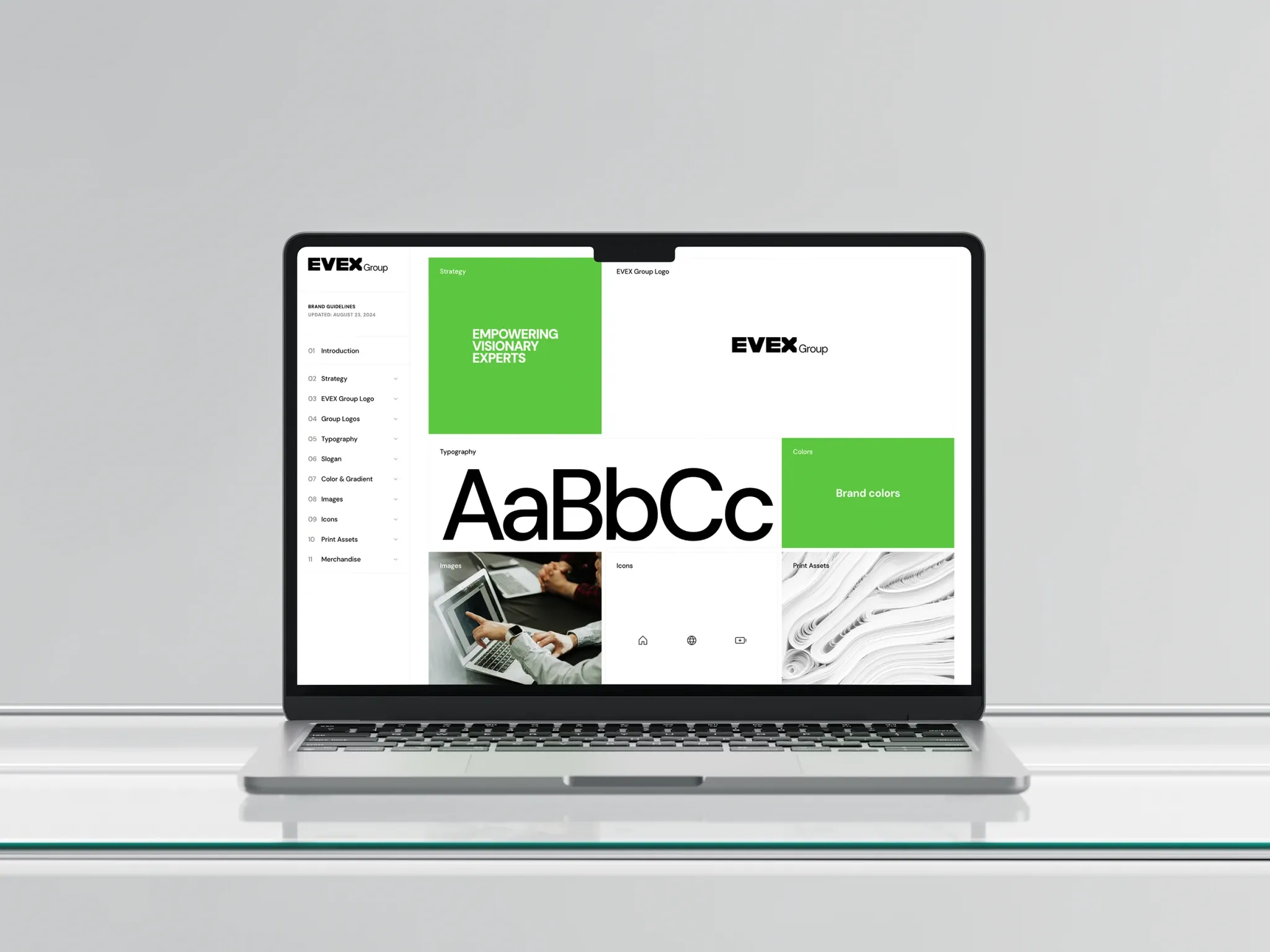
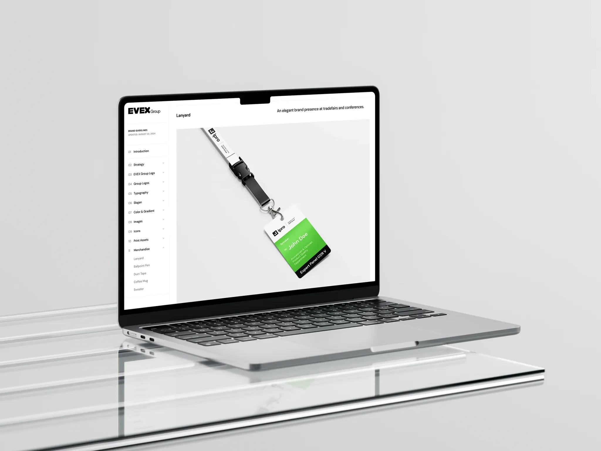
An online brand guide style guide with downloadable assets was developed by ND-DESIGN.WORKS to simplify the implementation in print, store and web and to present it consistently in all channels.
Task:
Strategically and historically analysing four well-known software brands for opticians and hearing care professionals in order to then stabilise them visually and communicatively for today's market based on the evaluations. A rebranding with the goal of a reduced, fundamental, sustainable design language.
The ‘X’ in itself and in combination with the ‘E’ results in arrows pointing in all directions. Interdisciplinary expertise and stability, focussed on the future, is thus illustrated.
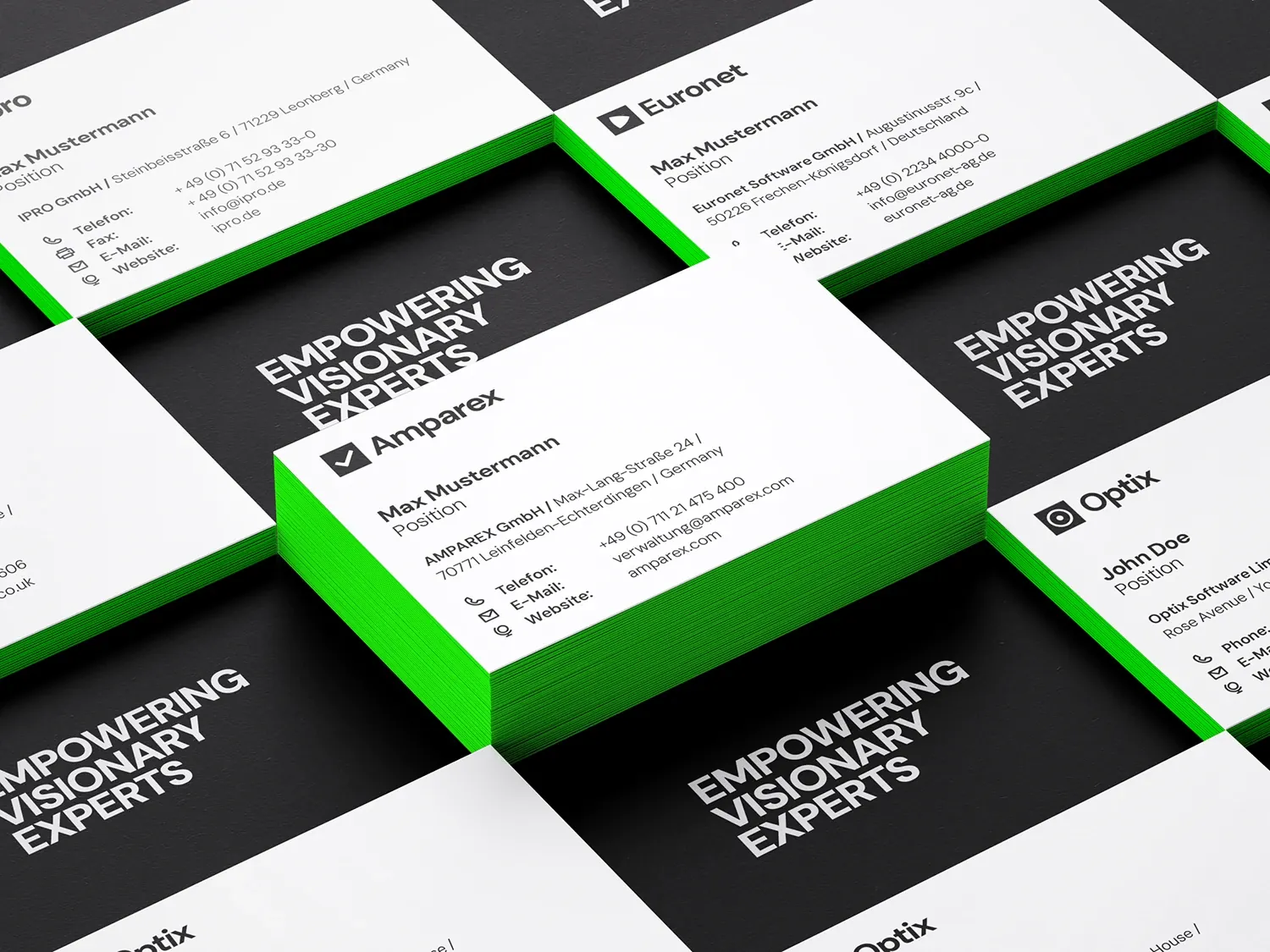
A colour gradient quotes the familiar colours of the four brands and combines them with new accents. The animation in digital channels creates calm modernity and depth.

Concept:
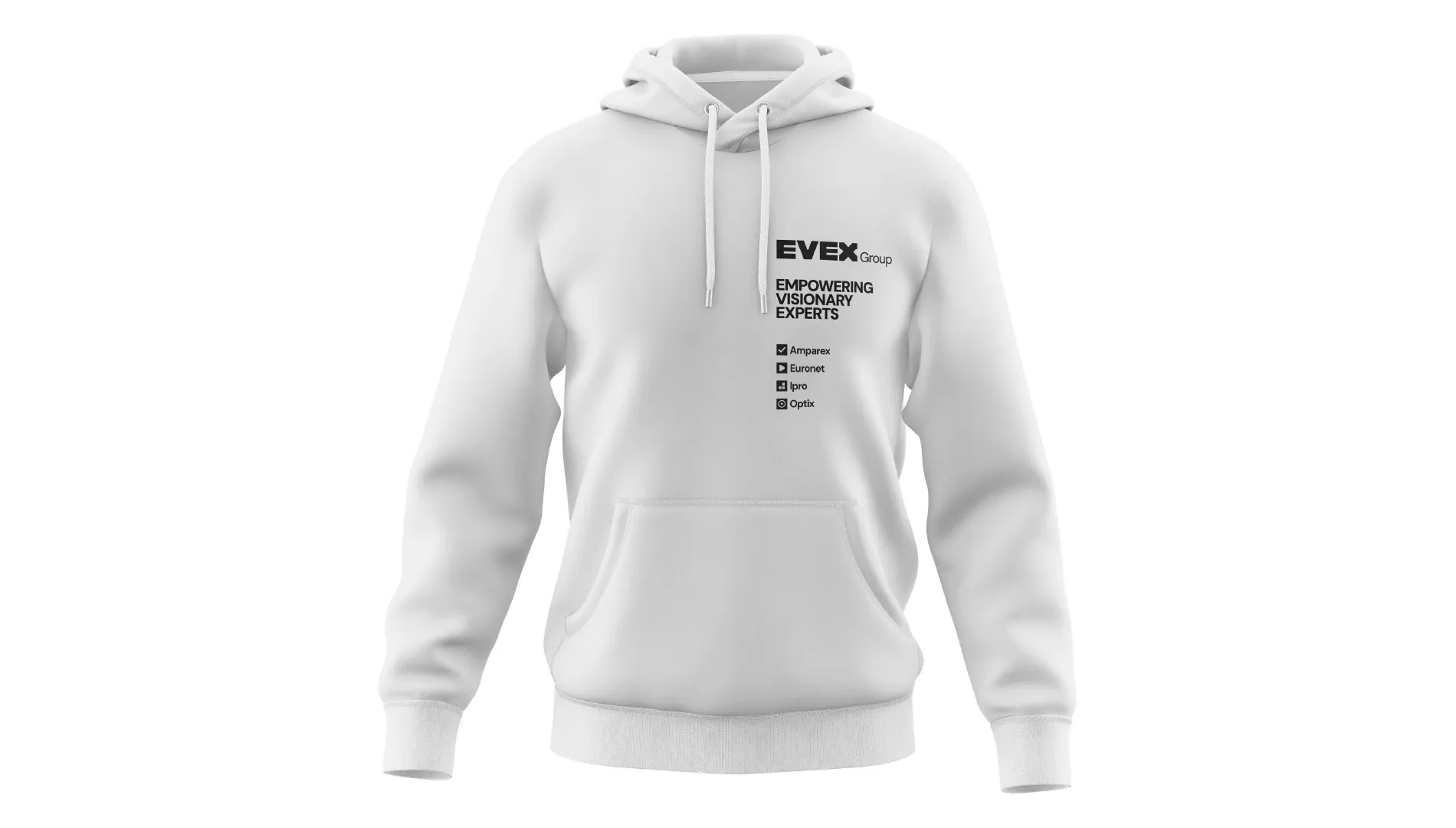
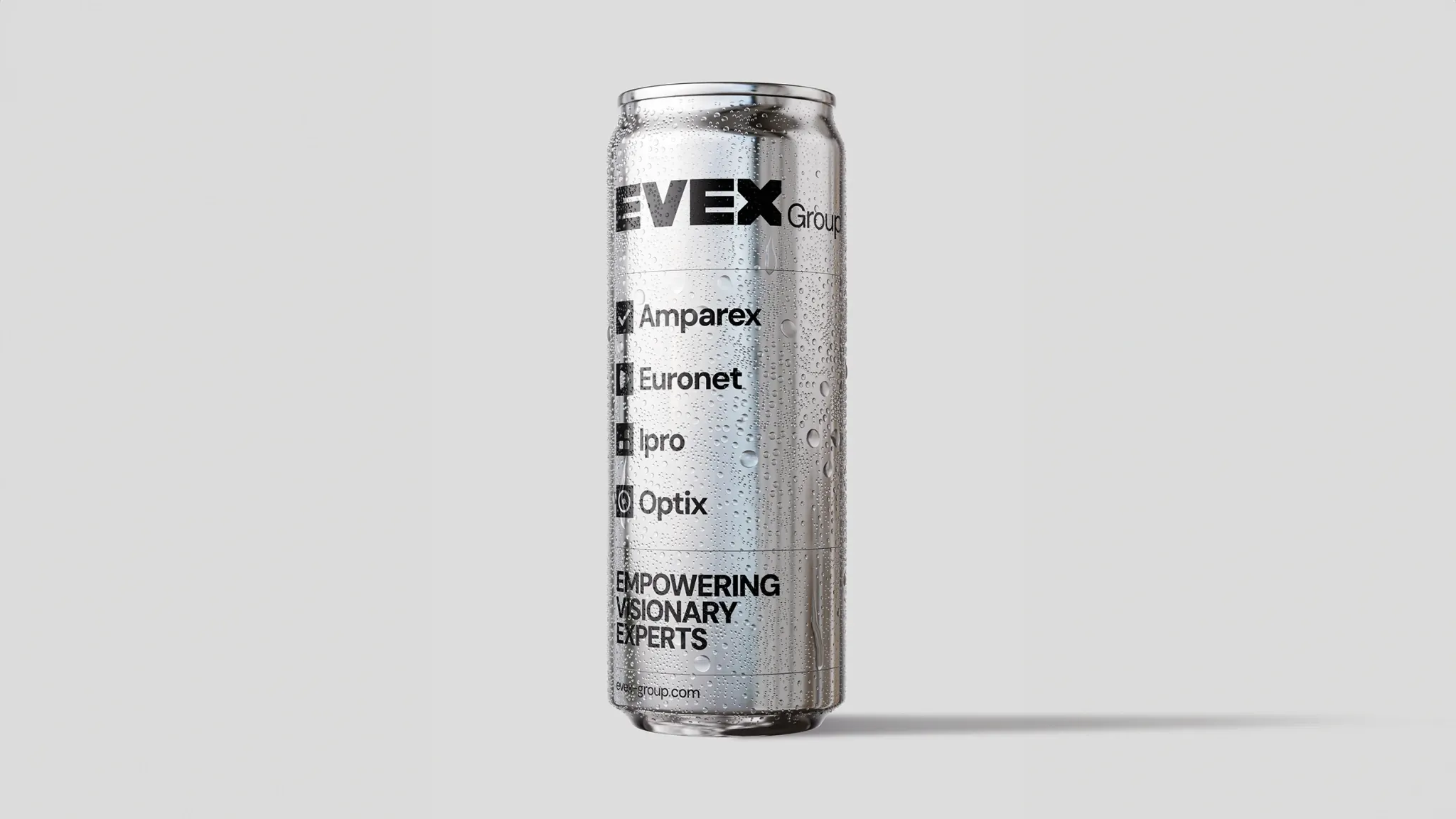
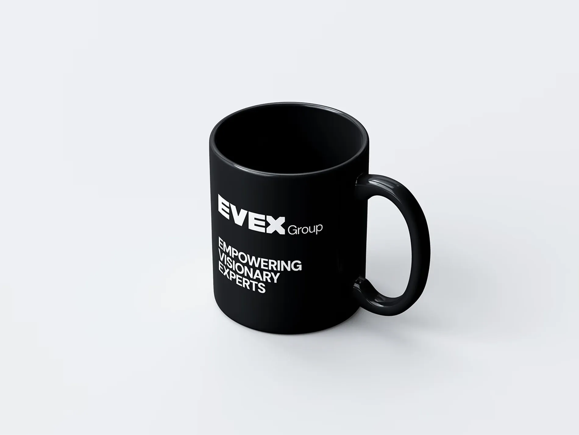
EMPOWERING VISIONARY EXPERTS is the slogan of the EVEX Group, and at the same time the meaning of the acronym itself. It is an allusion to the word ‘vision’, with which a core group of the EVEX Group is concerned: Ophthalmic optics and hearing acoustics, each with the approach of strengthening the customer's hearing and vision. Nowadays, however, the experts in the branches are not dependent on specialist knowledge alone - they also need a well-positioned IT system with a combination of various programmes from different manufacturers for different functions in branch management and project processing.
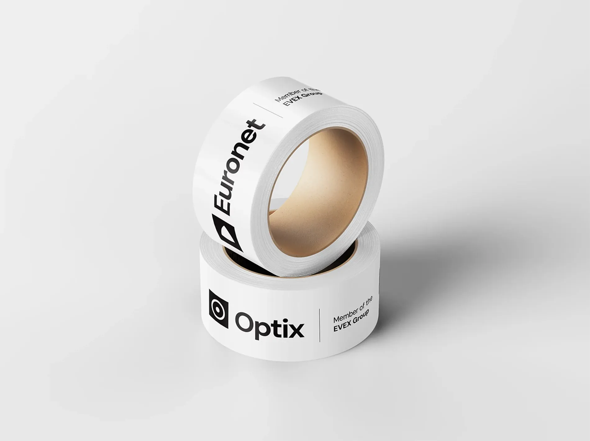
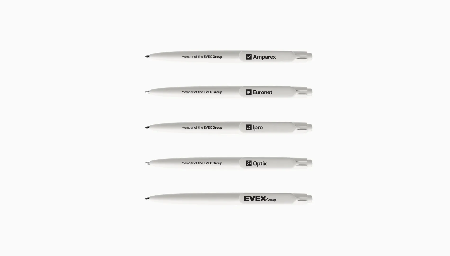
The EVEX Group therefore decided to bundle four companies to form a strong combination: Amparex, Euronet, IPro and Optix. As opticians and hearing care professionals have known these providers for years and use their products on a daily basis, the task was to create a transfer from familiar individual providers to a group. At first glance, this already appears as a new unit and is perceived together as ‘special forces’. It was important to be able to continue to be recognised as the original brand though. In this case, rebranding means strengthening an identity, not changing it.
The EVEX Group logo itself is also a statement for cross-market stability. It looks like a bridge over which the heaviest vehicles can drive safely. The large X in itself and in combination with the ‘E’ forms arrows in all directions to represent versatility. The development of an online brand guide style guide with assets helps the company to simplify the implementation in print, store and web and to present it consistently in all channels.